
For established businesses, refreshing a brand can be a balancing act. An outdated logo may be difficult to use across websites, social media, and printed materials, but replacing it entirely can mean losing the identity customers already recognize.
That was the challenge behind Kermode Accounting & Advisory's brand refresh. Based in Terrace, British Columbia, the firm wanted a more versatile and consistent visual identity without losing its distinctive Kermode bear or its connection to Northern BC. Here's how our team approached the redesign.
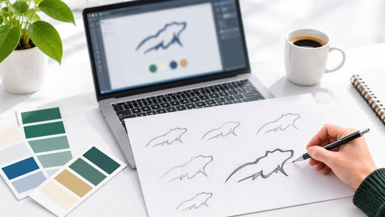
The Challenge: Modernizing Without Losing Brand Recognition
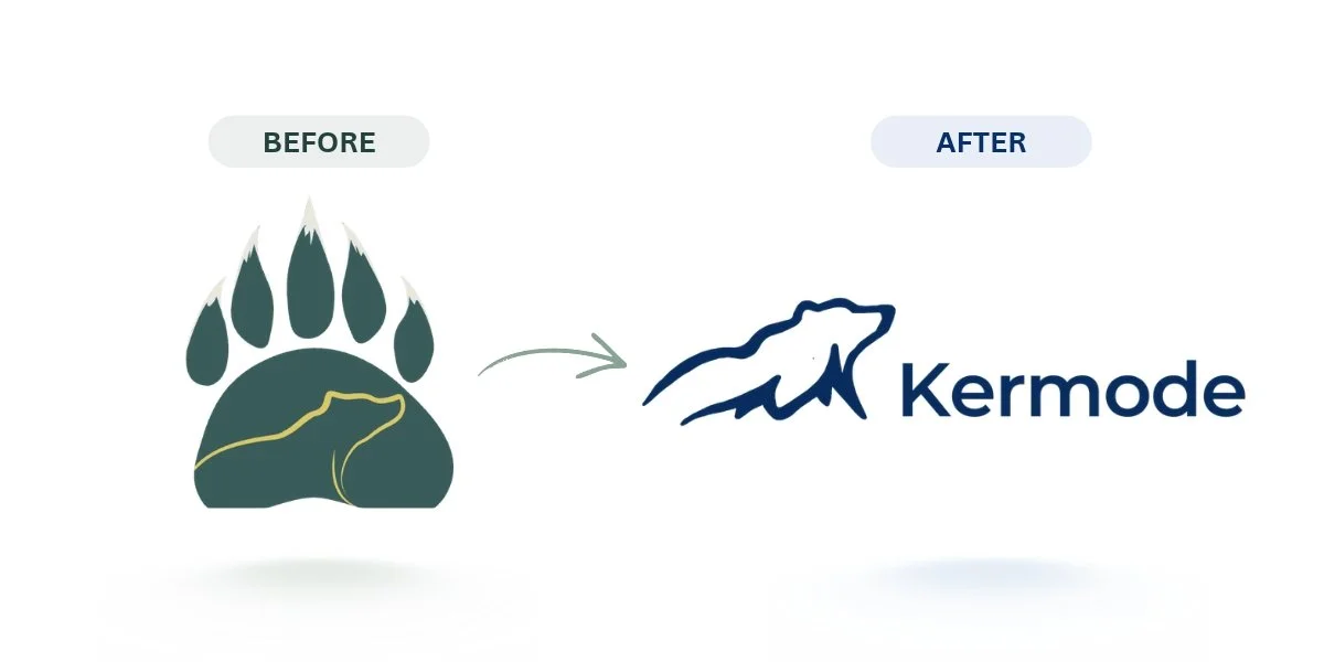
Our client's original logo had recognizable elements, but its finer details became difficult to distinguish at smaller sizes. Its colours didn't work equally well against different backgrounds, and the typography needed updating to better reflect the firm's professional identity.
The design also had an opportunity to strengthen Kermode's connection to Northern British Columbia. While the bear was already central to its identity, the surrounding Pacific Coast mountain landscape wasn't immediately recognizable in the original mark.
The challenge was to address these design limitations while preserving the familiar bear symbol and regional character that made Kermode's identity distinctive.
Our Approach
We kept the Kermode bear at the center of the redesign. It was the most recognizable part of the existing identity and connected the firm to its name and Northern BC roots.
Our approach was to simplify the bear's silhouette while incorporating elements of the Pacific Coast mountain landscape. We also considered how the refreshed logo would work at different sizes, on contrasting backgrounds, and across digital and printed materials.
To support the new design, we developed a coordinated visual system with updated typography, colours, and brand guidelines. This would give Kermode a more consistent identity without changing the elements that made it recognizable.
The Rebranding Process
We explored several creative directions, including simplified versions of the original mark, mountain-inspired lettering, different bear illustrations, and a paw concept. The paw design became too visually busy and the lettering approach lost some of the character associated with Kermode's name. The simplified bear offered the strongest balance between recognition and versatility.
From there, we worked on incorporating the surrounding mountain landscape into the bear's silhouette. Feedback on an early version revealed that its pointed nose made the animal resemble a fox. We adjusted the nose and refined the outline to make the bear more recognizable without adding unnecessary detail.
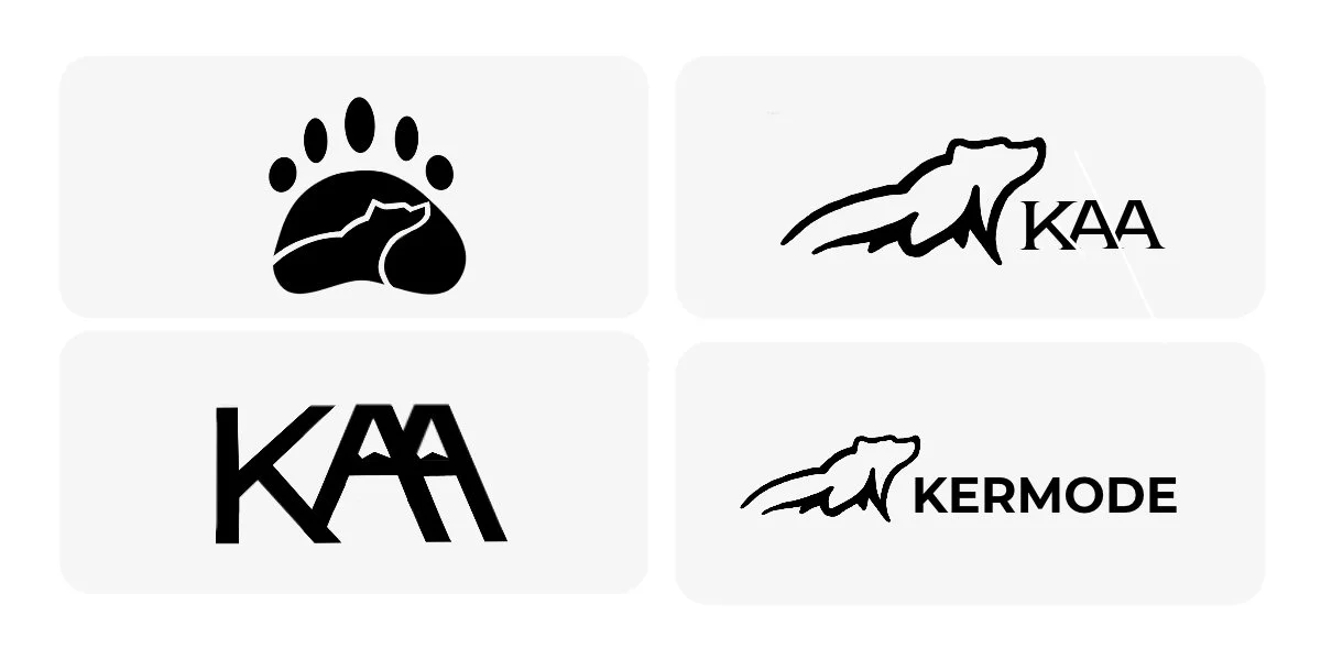
We also refined the wordmark to give Kermode greater prominence. The final logo pairs the bear-and-mountain symbol with the Kermode name, while Accounting & Advisory appears as supporting text in the extended branding used on materials such as the business card.
What We Delivered: A Complete Visual Identity System
The brand refresh extended beyond the logo. We developed a set of visual guidelines and branded materials that Kermode could use across its website, business communications, and marketing channels.
The branding package included:
Logo variations: Primary and secondary logo arrangements, standalone bear icons, and light and dark versions for different applications.
Brand guidelines: A four-colour palette, updated typography, and guidance on logo usage and visual consistency.
Business materials: The final business card design, letterhead, email signature, presentation and proposal templates, and a Teams background.
Website branding: Application of the refreshed logo, colours, and typography to Kermode's website.
The Outcome
Kermode's refreshed identity retained its recognizable bear symbol and connection to Northern British Columbia while addressing the practical limitations of the original design. The refined logo, updated typography, and coordinated colour palette gave the firm a cleaner, more cohesive visual identity.
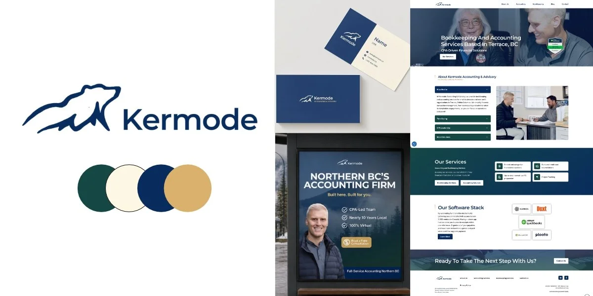
The refreshed branding also works across different applications, from the website and digital communications to business cards and presentation materials. These touchpoints now share a consistent visual direction while allowing flexibility for different formats.
Beyond the finished designs, Kermode now has brand guidelines and visual assets to reference when creating future materials, helping maintain a consistent identity across its communications.
Want to see how Kermode's refreshed branding fits into its broader digital marketing efforts? Explore the full Kermode case study to learn more about the work behind its online presence.
What Our Client Says
“Fantastic company! Mathea at Wild has been a standout advisor to our organization. We weren't going to do a re-brand, but she suggested it alongside our SEO, and we couldn't be happier with the results.”
- Scott van Dyk
KERMODE ACCOUNTING & ADVISORY
A Stronger Brand Doesn't Always Mean Starting Over
Kermode's refresh demonstrates the value of understanding an existing brand before changing it. The goal wasn't to replace its identity, but to make the design more practical for the ways the firm communicates and presents itself.
At Wild Visibility, we approach branding by considering both the business behind the identity and the places that identity needs to appear. The goal is to develop designs that look professional, work across different applications, and give businesses a consistent foundation for their communications.
Thinking about refreshing your brand? Let's talk about what makes your business recognizable and how we can build on it.